A website can look polished at first glance and still make visitors hesitate. The problem is often not the color palette, the animation, or the individual section design. The problem is website design consistency.
This is one reason beautiful websites still fail to convert: they may look impressive, but they do not always create a clear, trustworthy path for the user.
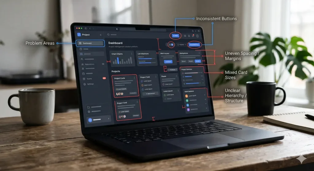
When every section feels like it belongs to a different system, users start questioning the business behind it. Different button styles, uneven spacing, mixed typography, changing layouts, and unclear message flow create small moments of doubt. One doubt may not destroy a conversion. Several doubts together usually do. Inconsistent website design usually appears through small details first: mismatched buttons, uneven spacing, weak hierarchy, different image styles, or sections that do not feel connected.
For service businesses, trust is not built only through testimonials or case studies. It is also built through structure. A consistent website makes the visitor feel that the company is organized, reliable, and easy to understand. An inconsistent website creates the opposite feeling, even when the offer itself is strong.
Why Website Design Consistency Affects Trust
Users do not analyze every design decision consciously. They feel the result. When the design system is consistent, the page feels easier to read and safer to act on. When the design changes too much, the visitor has to keep re-learning the interface.
That creates friction.
A headline style changes. A button color means one thing in one section and something else later. Cards have different spacing. Forms look disconnected from the rest of the page. The user may not say, “This website lacks UX consistency,” but they may feel that something is not fully professional. When a page feels untrustworthy, users often leave quietly instead of trying to understand what is wrong.
That feeling directly affects user confidence.
Website credibility is often shaped by these small visual and structural signals before the visitor reads every word on the page.
1. Keep Button Styles Predictable
Buttons are not decoration. They are decision points.
If your primary CTA changes color, size, wording, or visual importance too often, users lose a clear action path. A consistent website design should make the next step obvious. Consistent website design makes actions feel familiar, which reduces hesitation and keeps the visitor moving forward. Primary buttons should look like primary buttons everywhere. Secondary buttons should support the journey, not compete with it.
For example, if “Get Website Audit” is the main action, it should remain visually stronger than “Learn More” or “View Insights.” This helps users understand what matters most.
2. Build One Clear Visual Hierarchy
Visual hierarchy tells visitors what to read first, what to scan next, and where to act. Inconsistent hierarchy breaks that flow.
Many websites have strong hero sections but weak body sections. Some sections have oversized headings, while others hide important messages in small text. Some cards feel premium, while others look unfinished. This makes the website feel unstable.
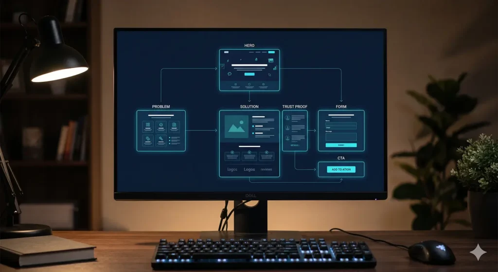
A better structure uses consistent heading sizes, clear spacing, and repeated section patterns. The goal is not to make every section identical. The goal is to make every section feel connected.
3. Align Every Section With the Same Message
Design consistency is not only visual. It is also strategic.
If your hero section says you build business systems, but the next section talks like a basic design service, the visitor receives mixed signals. If one area sounds premium and another sounds generic, confidence drops. Brand consistency helps the page feel intentional because the tone, visuals, proof points, and CTAs all support the same business position.
This is where website structure strategy becomes important, because trust is created by the way information is ordered, repeated, and connected.
Each section should support the same positioning. For a service business website, this means the copy, visuals, CTAs, and proof points should all move in one direction. Users should feel that the company knows exactly what it does and who it helps.
A conversion-focused website should not feel like separate design blocks placed on one page; it should feel like one guided journey where every section supports the next decision.
4. Use Consistent Trust Signals
Trust signals work best when they are integrated into the flow. Random trust elements can feel forced.
A testimonial placed with no context is weaker than a testimonial connected to a specific service promise. A case study link is stronger when it appears near a relevant problem. A process section works better when it supports the same decision flow as the rest of the page.
Website trust signals should not look like separate blocks added later. They should feel like part of the system.
5. Make Forms Feel Like Part of the Experience
A form is often the final moment before conversion. If it looks visually disconnected, too long, or inconsistent with the rest of the page, it can reduce confidence at the most important stage.
The form should match the website’s design language. Field spacing, labels, button style, microcopy, and confirmation messages should feel clean and controlled.
This is where conversion flow and design consistency meet. A visitor may like your offer, but a weak form experience can still create hesitation.
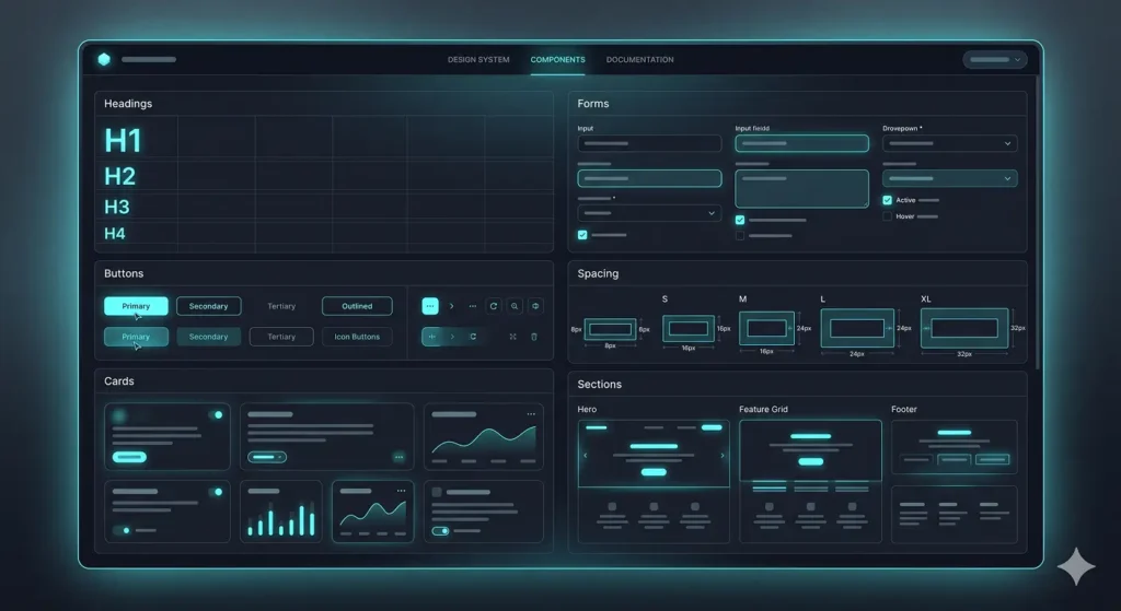
6. Create Reusable Layout Patterns
A strong website does not need a different layout idea for every section.
Reusable patterns make the experience feel more professional. For example, problem sections can follow one structure, solution sections another, and proof sections another. This keeps the page easy to scan while still giving each section a clear purpose.
This also improves future scalability. When new pages, posts, or service sections are added, they can follow the same design logic instead of becoming disconnected pieces.
7. Fix Inconsistency Before Full Redesign
Many businesses think they need a full redesign when the real issue is structural inconsistency. In many cases, small UX fixes such as clearer buttons, cleaner spacing, stronger form design, and better section order can improve confidence before a full redesign is needed.
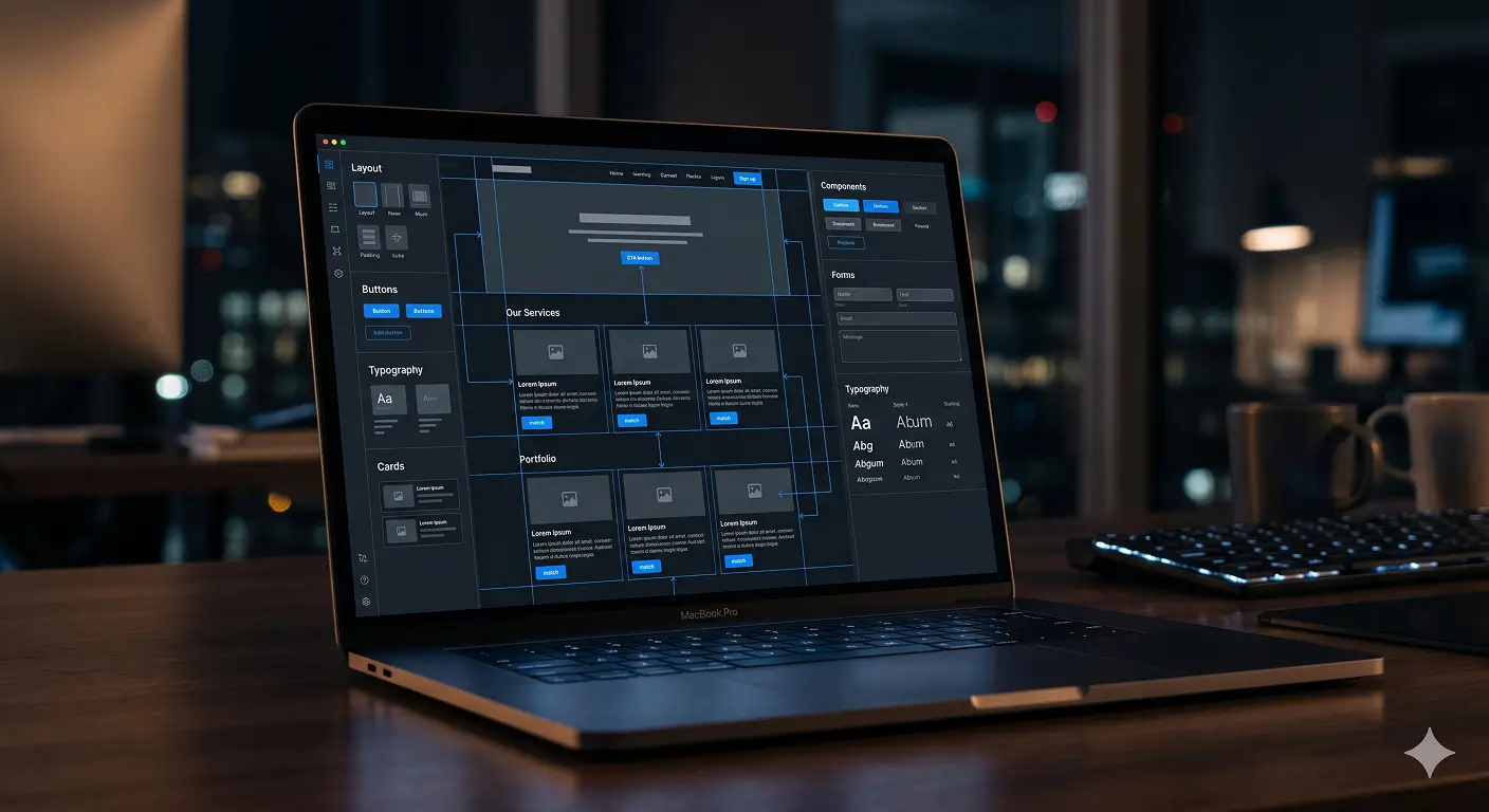
Before changing everything, review the design system. Check buttons, headings, spacing, colors, cards, forms, section order, and CTA logic. Then review whether the message stays consistent from top to bottom.
A website does not need to be visually loud to feel premium. It needs to feel controlled.
The Better Way to Think About Design Consistency
Website design consistency is not about making every section look the same. It is about removing unnecessary doubt.
A strong customer decision flow helps visitors move from first impression to trust, from trust to understanding, and from understanding to action.
When users move through a page, they should not feel visual confusion, message conflict, or decision friction. They should understand the business, trust the offer, and know what to do next.
High-performing websites usually feel simple on the surface because the structure behind them is controlled, consistent, and easy to follow.
For service businesses, this is where design becomes more than appearance. It becomes part of the sales system. A consistent website supports trust, improves conversion flow, and makes the brand feel more reliable before a conversation even starts.
Is Your Website Consistent Enough to Build Trust?
If your website looks good but visitors still hesitate, the issue may not be design quality. It may be an inconsistent structure, weak trust flow, unclear CTAs, or disconnected sections.