
Why Visual Hierarchy Defines Trust Before Content Does
A visual hierarchy website structure determines how users feel about your business before they fully read your content.
People don’t analyze websites line by line. They scan. They compare. They decide within seconds whether the page feels clear or confusing. A weak visual hierarchy website layout immediately creates hesitation, even if your offer is strong.
This is why visual hierarchy in web design is not just a design principle. It directly affects trust, perception, and decision-making.
Clarity Is the First Trust Signal
Most businesses try to build trust through branding, testimonials, or messaging. But before any of that works, users need clarity.
A well-structured visual hierarchy website removes friction by guiding attention in the right order:
- What is this?
- Why does it matter?
- What should I do next?
Strong hierarchy web design answers these questions without effort. Weak structure forces users to figure it out themselves.
This is where many websites fail — not because they lack information, but because they fail to prioritize it.
What Users See First Shapes What They Believe
On a visual hierarchy website, what users notice first becomes what they believe matters most.
If visuals dominate over meaning, the site feels decorative.
If multiple elements compete for attention, the page feels chaotic.
If nothing stands out, users feel lost.
By contrast, websites with good visual hierarchy feel intentional. The headline is clear. Supporting content follows logically. Proof appears where it’s expected. The call to action is obvious.
This structured flow creates confidence. And confidence is the foundation of trust.
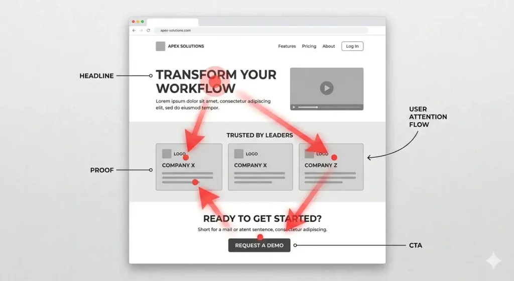
The Role of Hierarchy in Landing Page Decisions
The visual hierarchy of an effective landing page is built around decision flow, not design preference.
Every section has a role:
- Headlines create orientation
- Supporting text builds understanding
- Proof reduces doubt
- CTAs guide action
A strong visual hierarchy website aligns these elements so users move forward naturally. A weak one breaks that flow and increases hesitation.
When users have to think too much about where to look or what to do, trust decreases — even if the offer itself is strong.
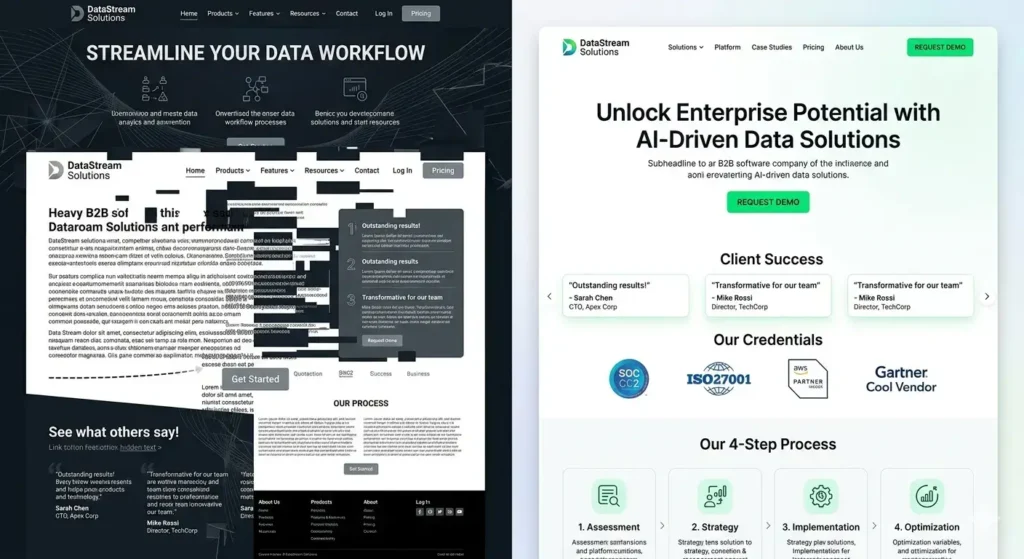
Visual Hierarchy Controls Trust Signals
Trust elements alone are not enough. Their placement matters more than their presence.
A visual hierarchy website ensures that website trust signals appear at the right moment in the user journey:
- Reviews when doubt appears
- Process explanation when uncertainty increases
- Guarantees before commitment
If these elements are buried or visually weak, they lose impact.
Hierarchy determines whether trust is felt — not just displayed.
Structure Improves Conversion Without Aggression
Many businesses try to increase conversions by making pages louder:
- Bigger buttons
- More CTAs
- Stronger colors
But a strong visual hierarchy website does the opposite. It creates clarity, not noise.
When hierarchy is correct:
- Users don’t search — they follow
- Decisions feel easier
- Pages feel more professional
This is why conversion improves without making the page feel pushy.
The Real Problem Most Websites Have
Most websites don’t have a design problem.
They have a structure problem.
A visual hierarchy website is not about looking better. It’s about guiding attention, reducing friction, and building trust through order.
If your site looks good but still underperforms, the issue is often not your content — it’s how that content is organized.
And until that structure improves, performance will stay limited.

Improve Trust by Fixing What People Notice First
If your website looks professional but still feels weaker than it should, the issue may be structural. A clear audit can show where your hierarchy, trust flow, and page emphasis are reducing conversion.