
Most businesses assume poor results mean they need more traffic, better visuals, or a stronger offer. In reality, many of them first need a proper conversion rate diagnosis. A website can look modern, load “well enough,” and still quietly fail at turning attention into action. That is why guessing is dangerous. If you do not know where people hesitate, where trust drops, or where the flow breaks, you end up changing the wrong things.
A useful conversion rate diagnosis starts by treating the website like a system, not a decoration. People do not convert because of one isolated button. They convert when the message is clear, the page feels trustworthy, the journey makes sense, and the next action feels easy. When one of those parts is weak, the whole site underperforms.
Why Conversion Rate Diagnosis Matters
A low-converting website often hides its problems behind surface-level signals. You may still receive some inquiries. You may still get occasional leads. But that does not mean the system is healthy. It only means some visitors are working hard enough to push through friction.
A serious conversion rate diagnosis helps identify whether the issue is caused by:
- weak positioning
- unclear user flow
- low trust
- performance friction
- broken lead capture logic
- poor mobile experience
- lack of follow-up structure
Without that diagnosis, businesses usually redesign too early, advertise too early, or blame traffic too early.
1. Check Message Clarity Above the Fold
The first thing to inspect is not design quality. It is clarity. When a visitor lands on the page, can they understand what you do, who it is for, and what they should do next within seconds?
If the headline is vague, the subheading is generic, or the CTA feels disconnected, users lose momentum immediately. This is one of the most common website conversion problems because businesses often describe themselves in broad language instead of showing value in a direct way.

Start your conversion rate diagnosis by reviewing the hero section and asking:
- Is the offer obvious?
- Is the outcome understandable?
- Is the CTA connected to intent?
- Does the page speak to the right type of visitor?
If the first screen creates confusion, later sections rarely recover the drop.
Many businesses think improving visuals will fix this, but in reality, most issues start earlier — at the structural level. If the foundation is weak, even a well-designed page struggles to perform. This is why understanding how websites are structured as systems matters.
2. Check Whether the User Flow Feels Natural
Many websites do not fail because they lack content. They fail because content is arranged without flow. Visitors should move from understanding, to trust, to action. If sections feel random or disconnected, the journey becomes mentally expensive.
A good conversion rate diagnosis looks at whether the page answers the right questions in the right order. Users usually want to know:
- what this is
- why it matters
- why they should trust it
- what happens next
When those answers are scattered, hidden, or repeated without structure, users leave. This is where website user flow becomes critical. The page should reduce decision effort, not increase it.
When a website lacks a clear system behind it, even good content fails to guide users effectively. Structure is what connects information into a journey.
3. Check Trust Before the CTA
A CTA alone does not create action. Trust creates action. If users are asked to click, book, or submit before they feel safe, conversion drops. That is why trust signals on a website should be reviewed during every conversion rate diagnosis.
Trust can come from:
- clear service explanation
- visible proof of work
- testimonials
- real business identity
- transparent process
- strong content structure
- consistent visual credibility

If the page asks for commitment too early, or if proof appears too late, hesitation increases. Many low-converting pages have a CTA, but no trust layer supporting it.
Sometimes a website looks modern but still feels unreliable to visitors. This gap between appearance and perception is one of the most overlooked conversion issues.
4. Check Mobile Friction Carefully
A desktop review is not enough. Most users experience the site on mobile first, especially in service and lead-based businesses. A proper conversion rate diagnosis must test the entire journey on a phone.
Look for:
- oversized sections
- hard-to-read text blocks
- poor button spacing
- intrusive popups
- slow-loading visuals
- sticky elements blocking content
- confusing form interactions
Mobile friction does not always look dramatic. Sometimes it simply makes the site feel tiring. That is enough to reduce action. Many businesses lose conversions not because visitors reject the offer, but because the journey feels harder than it should.
5. Check Performance at Key Decision Points
Performance matters most where people are close to action. A slight delay before a form loads, a jumpy layout near a pricing section, or a slow mobile interaction before checkout can quietly reduce results. This is why website performance issues belong inside conversion rate diagnosis, not outside it.
Do not only ask whether the homepage is fast. Ask whether the important moments are smooth:
- opening a service page
- clicking a CTA
- loading a form
- switching between sections
- using the site on mobile data
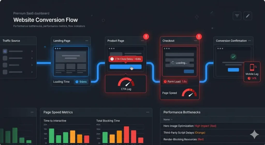
If speed creates hesitation at the moment of intent, the business pays for it later in lost leads.
6. Check Forms and Lead Capture Logic
A form working technically does not mean the lead system works strategically. Many businesses think the website is converting poorly when the real issue is weak capture logic. A short website conversion audit should examine whether the form asks the right questions, appears at the right stage, and leads into a real follow-up process.
Ask:
- Is the form too early or too long?
- Does it match the visitor’s intent?
- Is the CTA specific enough?
- Does the user know what happens after submission?
- Is there a follow-up workflow behind the form?
A site can collect submissions and still underperform if the path from visitor to sales response is weak.
Many websites collect data but fail to convert it into real business outcomes because there is no structured process behind the form.
7. Check for Structural Conversion Leaks Across the Whole Site
The final step in conversion rate diagnosis is zooming out. Sometimes no single issue looks severe on its own, but several smaller gaps combine into one underperforming system. Weak clarity, average trust, moderate speed issues, and unclear follow-up can quietly become major conversion leaks.
That is why high-performing websites are usually not built around one trick. They are built around alignment. Message, structure, trust, UX, and action all support each other. Once that alignment is missing, even decent traffic produces weak results.
If you are wondering why visitors do not convert, do not start with assumptions. Start with diagnosis. The goal is not to make the site look busier. The goal is to remove friction from the path between attention and action.
Even with strong traffic, many websites fail to generate revenue because hidden structural issues are never addressed. Without a proper diagnosis, these problems continue to reduce performance over time.
Diagnose the Real Reason Your Website Is Not Converting
A low-converting website is usually a system problem, not a single mistake. Small gaps in clarity, trust, flow, and performance reduce results over time. Instead of guessing, identify where your system breaks and fix it properly.