Why Website Conversion Issues Usually Start Before the CTA
Website conversion issues rarely begin at the final button. They usually begin much earlier, when a visitor lands on the page and cannot quickly understand what the business does, why it matters, who it is for, or what should happen next.
A user may like the design, scroll through the page, and still leave without taking action. That does not always mean the offer is weak. It often means the conversion flow is unclear. The website gives information, but it does not guide the visitor through a confident decision.
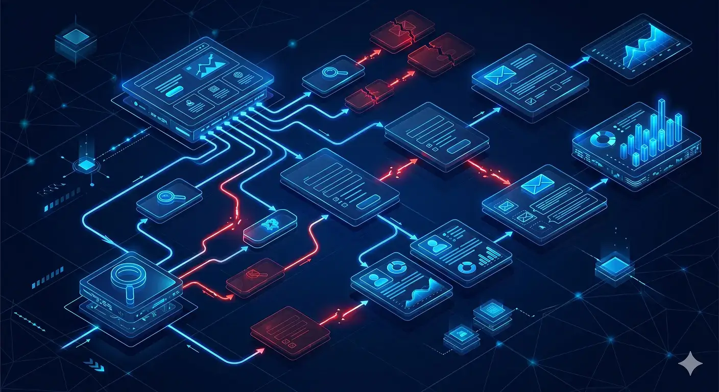
This is why a beautiful page can still underperform. A conversion-focused website is not only about visuals. It connects message, trust, speed, form logic, follow-up, and sales handling into one clear path.
1. The Main Message Is Too Broad
Many websites open with a headline that sounds professional but says very little. Phrases like “modern solutions for your business” may look clean, but they do not answer the visitor’s real question: “Is this for me?”
When the first screen is vague, users have to work harder to understand the offer. That extra thinking creates friction. Strong pages make the category, outcome, audience, and next step obvious within seconds.
Your homepage or landing page should not only introduce your company. It should position the problem, clarify the value, and direct the user toward the right action.
2. The Page Looks Good but Does Not Build Trust
Users often hesitate when the website feels polished but unsupported. Good design can create attention, but trust needs proof. Without clear service details, client examples, process explanation, reviews, or realistic expectations, the visitor may not feel safe enough to submit a form.
This is one of the most common website conversion issues in service businesses. The page asks for commitment before it earns confidence.
Trust is not decoration. It is a structural part of the page. Every claim should have support, every service should feel understandable, and every CTA should appear after enough context.
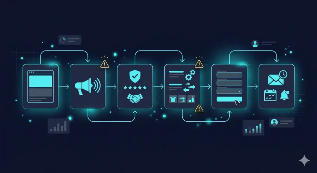
3. The User Journey Has Too Many Decision Gaps
A weak website often jumps from problem to CTA without helping the visitor process the decision. It may explain the service, but not the steps, timeline, pricing logic, result expectations, or what happens after contact.
That breaks the conversion flow. Users do not only need information. They need sequence.
A better structure answers questions in the order they appear in the customer’s mind: What is this? Is it relevant to me? Can I trust it? What exactly happens next? What do I risk by starting?
When these questions are not answered, users hesitate before taking action.
4. Forms Feel Like Work Instead of Progress
Forms are often treated as a technical detail, but they are one of the highest-friction points on a website forms feel confusing. Too many fields, unclear labels, weak mobile spacing, no confirmation message, or broken email delivery can quietly reduce inquiries.
This is where slow website issues and UX issues overlap. Even if the page loads fast, a form that feels confusing, delayed, or unreliable can stop a motivated user.
A good form should feel simple, safe, and purposeful. Ask only for what is needed at that stage. Explain what happens after submission. Confirm that the request was received. Then make sure the internal team actually gets the lead.
5. Leads Are Captured but Not Handled Properly
Some websites technically generate leads, but the business still loses opportunities because customer handling is weak. A form submission may go to a general inbox. A WhatsApp request may not be assigned. A quote request may not enter a clear follow-up process.
This is not only a sales problem. It is a website system problem.
Without CRM integration, the website may collect interest without creating accountability. Leads should be tracked, categorized, followed up, and connected to the right person or workflow. Otherwise, the website becomes a passive inbox instead of a business tool.

6. There Is No Automation Behind the Action
When users take action, the system behind the website should support the next step. That may include instant email confirmation, internal notifications, lead source tracking, booking details, CRM updates, or automated routing.
Without lead flow automation, the business depends too much on manual reaction. This creates delays, missed messages, and inconsistent customer experience.
A strong website automation system does not replace human communication. It protects it. It makes sure every inquiry is received, organized, and ready for the next business action.
7. Optimization Focuses on Scores Instead of Sales Flow
Many businesses invest in website performance optimization but only measure speed scores. Speed matters, especially for user experience and search visibility. Google describes Core Web Vitals as real-world experience metrics for loading performance, interactivity, and visual stability.
But speed alone will not fix weak positioning, confusing CTAs, poor proof, broken forms, or disconnected follow-up. Those are deeper website conversion issues.
The goal is not only to make the website faster. The goal is to make the website easier to understand, easier to trust, easier to act on, and easier for the business to respond to.
A website that converts is not just a page. It is a connected decision and handling system.

Stop Guessing Why Users Don’t Convert
If your website gets visitors but not enough inquiries, the problem may not be traffic. It may be structure, trust, forms, customer handling, or the system behind the action.